The temporary exhibition at the MoMA was the Brice Marden retrospective. It was very much like going to a restaurant with only one thing on the menu; I mean, why give me a menu? Marden has done three types of paintings in a decades long career. First he did flat, but not immaculate, rectangles of neutral color slightly misregistered on their canvases, so in the margins you could see the brush hairs and paint runs. Then he eliminated the margins and clustered more colorful pastel canvases. Finally, he grouped several interwoven, chaotic but evenly spaced loops on larger and more colorful canvases.
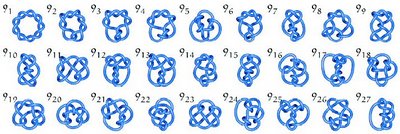
I must say that I was unenthused about the work. I didn't expect to be. I was surprised that the paintings didn't reward closer examination. I appreciate the complexity of the latter type of work and its relationship to mathematical knot diagrams. In relation to string theory, the paintings almost have a cosmological overtone. But I find knot diagrams, and not the paintings, to be more satisfying to look at. As for cosmology, Barnett Newman's and Pollock's paintings are philosophy by example, whereas Marden's are simply examples of tasteful painting; they're domesticated. I concede, though, that this attitude might be the result of me waking up at five in the morning and traveling five hours to see the stuff.
 Link to the source of this image.
Check out this video entitled "The Optiverse". It is a narrated tour of the topology of an optimal spherical inversion. I don't claim to understand half of what the narrator says, but the overall effect is like a public service announcement from Tron. (Link.)
* * *
I felt somewhat dizzied taking in the permanent collection. I am used to going to art venues where I am intimately familiar with the collection, like the Philadelphia Museum of Art or the Art Institute of Chicago. In these collections I can criss-cross the museum, actively following whatever associations I am making. I felt subdued by the MoMA collection, and felt that I could only absorb what was around me, so I spent a long time gawking.
There were some odd wall-hung assemblage works by Piero Manzoni, the guy who canned and sold his own shit, but I found the Kurt Schwitters junk-art a few rooms over to be more eloquent. Talk about being overshadowed by precedents, the room I spent the least amount of time in was the conceptual art room. I walked in and thought, "Duchamp annihilates these people", and walked out. I did the same thing with Robert Gober's "Prison Window" piece (image).
There were several things in the design and architecture galleries that were of interest:
There was a large gallery devoted to the new Central Chinese Television Headquarters in Bejing (image), with some truly awe inspiring construction photos.
I watched a grade school class play with some interactive applets that made jumping and warbling geometry and text in response to sound and movement. These were by John Maeda, a professor at MIT Media Lab. He has an intriguing project on his website called "Design by Numbers" which is "a global initiative to teach computer programming to visual artists through a freely available, custom software system that he designed." (source). I plan on spending at least an afternoon with this program. (Link.)
There was a set of large, slotted cards with various pictures and patterns printed on them, designed by Charles and Ray Eames. This seems fertile as a vehicle for free association, but they frown on museum goers opening the glass cases to play with the objects, so I must buy a set, or make my own. (image) One of the Eames team's most famous creations is a film they did for IBM entitled "The Powers of Ten", which is viewable on Google Video! (Link.)
There was also a poster by the Beggarstaff studio, who developed a beautiful paper cut-out style for large commercial posters in the late nineteenth century. They also have a certain hill named after them in a certain virtual world. (image)
* * *
Roughly a third of the galleries in Chelsea were closed because of the holiday. Leave it to the art world to close up shop on the largest shopping day of the year. The best show was Yayoi Kusama's, whose work has a very large range, but with a very strong synthesis. My favorite pieces were bunches of oversized pinballs (image), which serve as the contemporary equivalent of Don Judd's wall mounted stacks (image), in that they located the viewer in space. Other notables in Chelsea were Yun-Fei Ji and Nigel Cooke.

2 comments:
Sounds like an interesting and thoughtful tour.
I gather that there is quite a lot of shuffling of the collection at the MOMA as the things that you mention here appear to be entirely different than what I saw the last time I was in New York (albeit that was 10 monthes ago).
Those mathematical knot diagrams are sweet.
I am still trying to wrap my brain around the idea of using mathematical and scientific diagrams in some capacity in making art. The process of making such diagrams, I have been told from friends that work in scientific research, is entirely unscientific in character and the decisions about how to make these models or the computer programs that generate them are largely aestethic in nature (adding color or modelling effects where they do not exist for example). With computer generated models there appears to be a distinct "WHIZ-BANG!" attitude always associated with techies. BoingBoing oftion catalogs these types of associations when they are applied in big art projects, particularly when MIT guys are involved.
u guys talk good about arts.
Post a Comment